I've never seen this kind of benchmark graph before, and it looks really neat! How was this generated? What tool was used for the benchmarks?
(I actually spent most of Sep/Oct working on optimizing the Immer JS immutable update library, and used a benchmarking tool called `mitata`, so I was doing a lot of this same kind of work: https://github.com/immerjs/immer/pull/1183 . Would love to add some new tools to my repertoire here!)
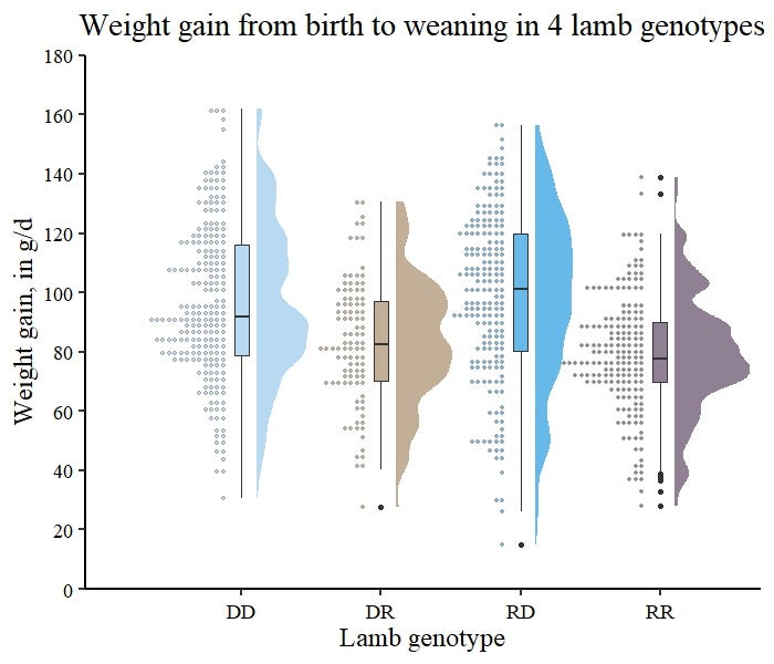
It's in essence a histogram for the distribution, with smoothing, and mirrored on each side.
It looks nice, but is not without well-deserved opposition because 1) the use of smoothing can hide the actual distribution, 2) mirroring contains no extra information, while taking up space, and implying the extra space contains information, and 3) when shown vertically, too often causes people to exclaim it looks like a vulva.
Sure. Very few distributions have lovely square edges, which otherwise indicate some very high frequencies in the distribution, or quantized values.
But that also means we are used to seeing histograms and their bin count and widths in order to estimate possible variances from the true distribution;.
While it's much harder to do the same with violin plots.
(I actually spent most of Sep/Oct working on optimizing the Immer JS immutable update library, and used a benchmarking tool called `mitata`, so I was doing a lot of this same kind of work: https://github.com/immerjs/immer/pull/1183 . Would love to add some new tools to my repertoire here!)